Mamamira
- Discipline
- Branding, motion, illustration
- Year
- 2025
- Client
- Mamamira
Branding for a food and catering company built on comfort, flavour and home-style cooking.
Mamamira is a branding project for a food and catering company built on comfort, flavour and a passion for home-style cooking.
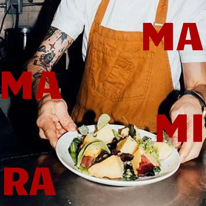
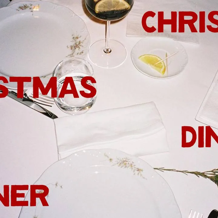
The visual identity balances warmth and simplicity, because the best meals, and the best brands, feel like they come straight from the kitchen, not a factory. The identity carries through into motion and illustration.
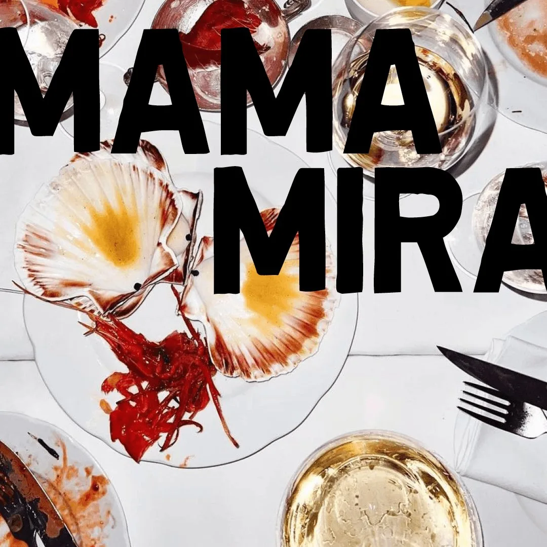
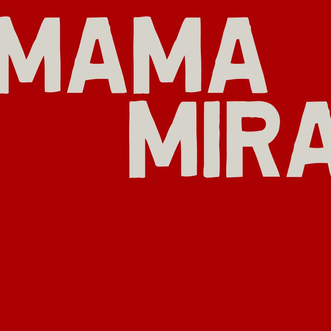
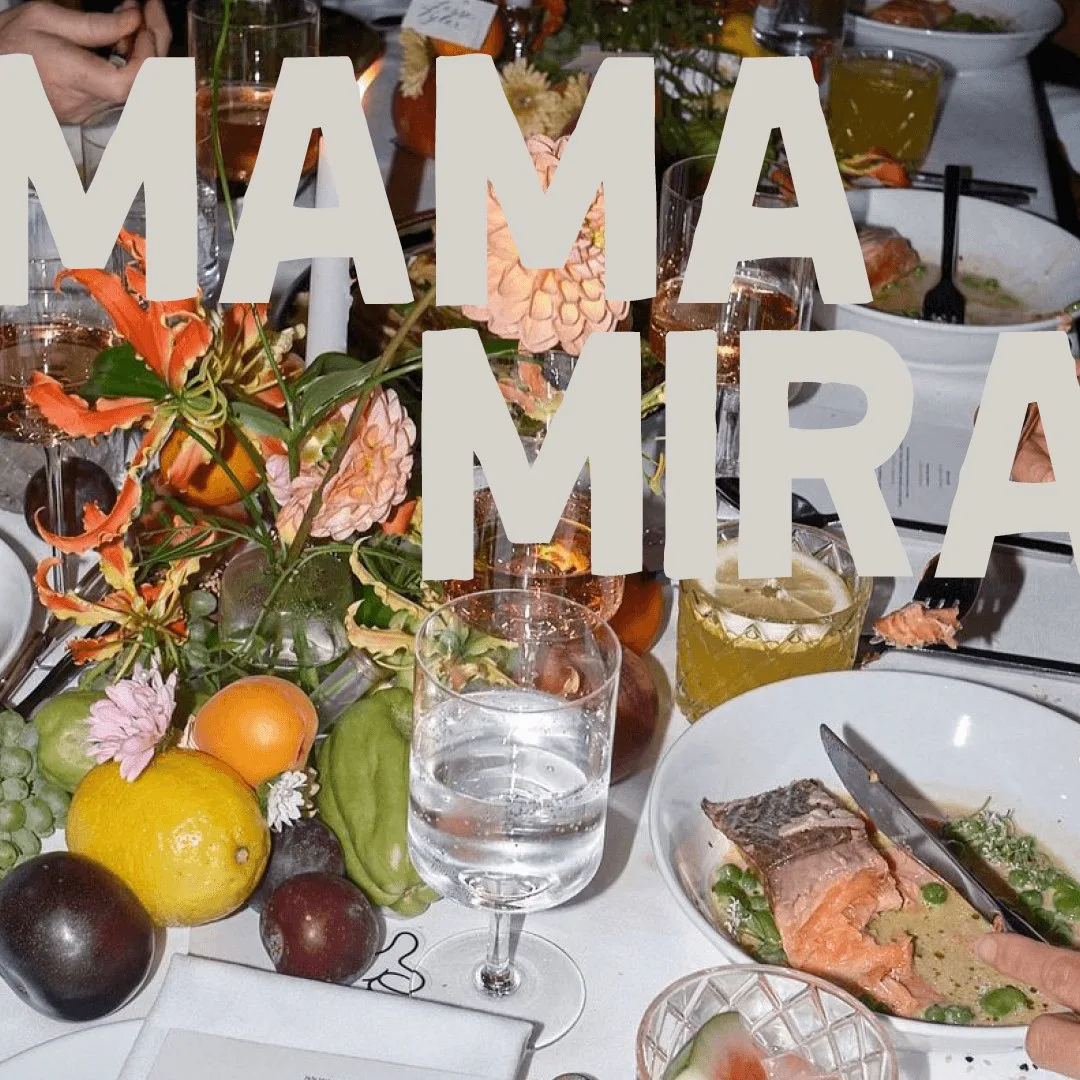
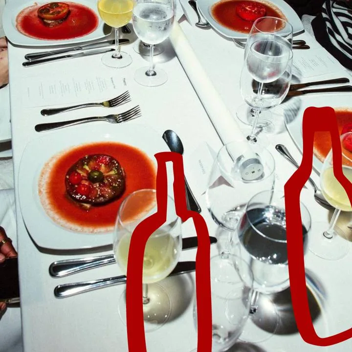
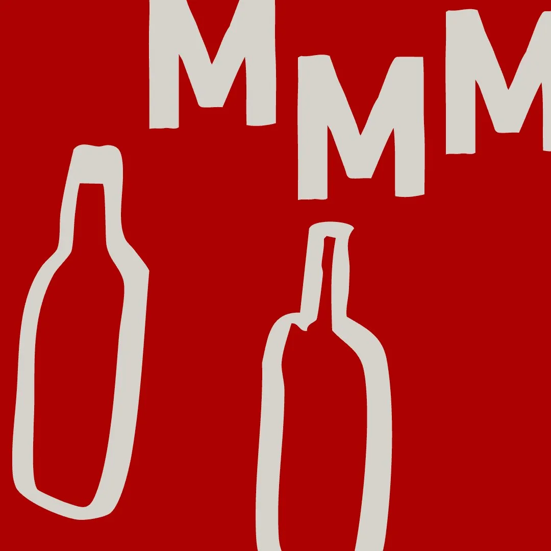
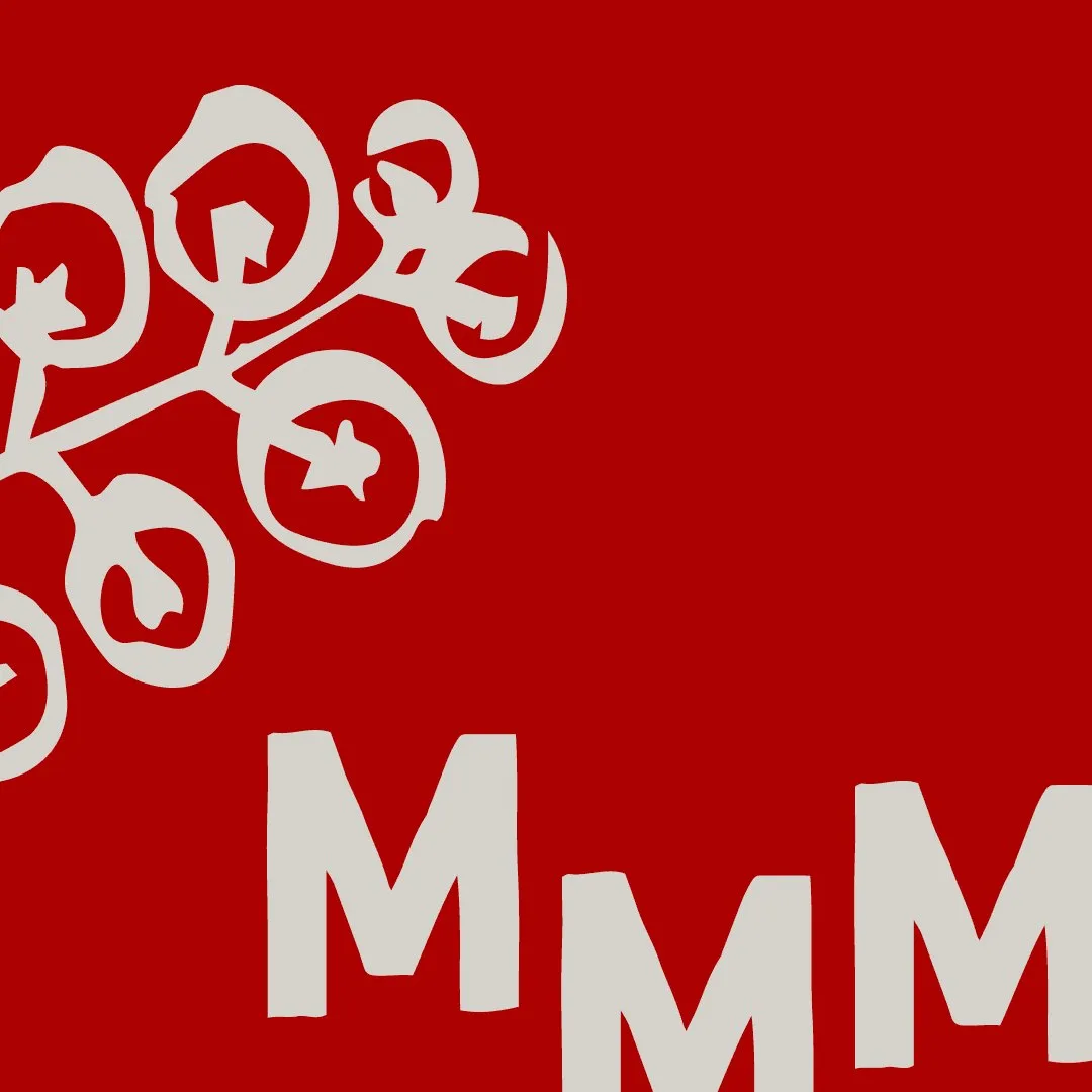
Chef holding a salad, red MAMAMIRA letters01 / Table setting with red bottle shapes02 / Christmas dinner table with red type03 / Dinner table with flowers and fruit, MAMA MIRA in light type04 / Scallops and glasses from above, MAMA MIRA in black type05 / MAMA MIRA wordmark on red06 / Tomato vine illustration with MMM on red07 / Bottle illustrations with MMM on red08 / Scattered MAMA MIRA letters on red09