Arch*i
- Discipline
- Branding, brand guidelines
- Year
- 2026
- Agency
- Hartstikke
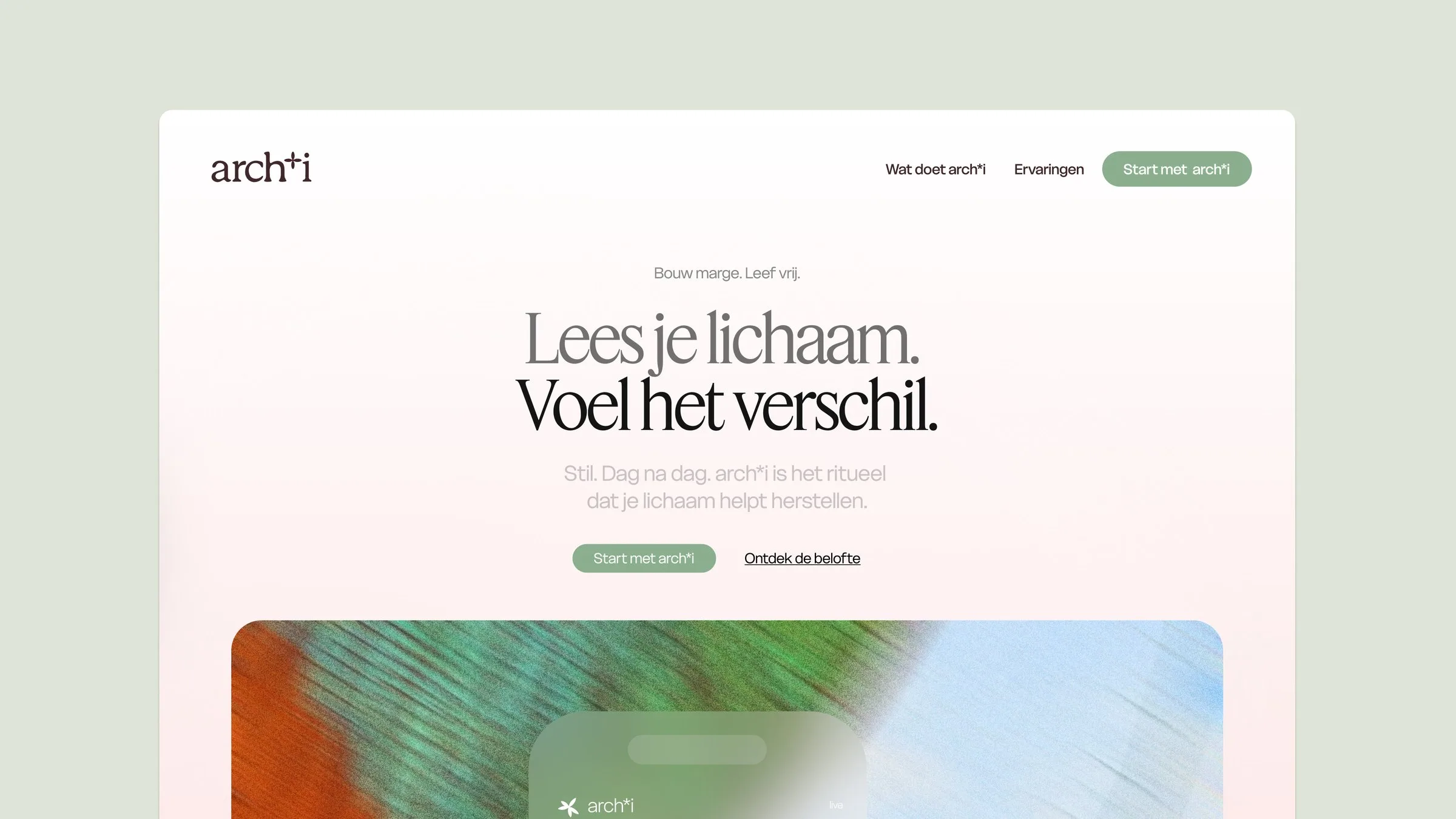
Read your body. Feel the difference. A brand for a health coach that shows how much margin your body has left.
A Hartstikke project.
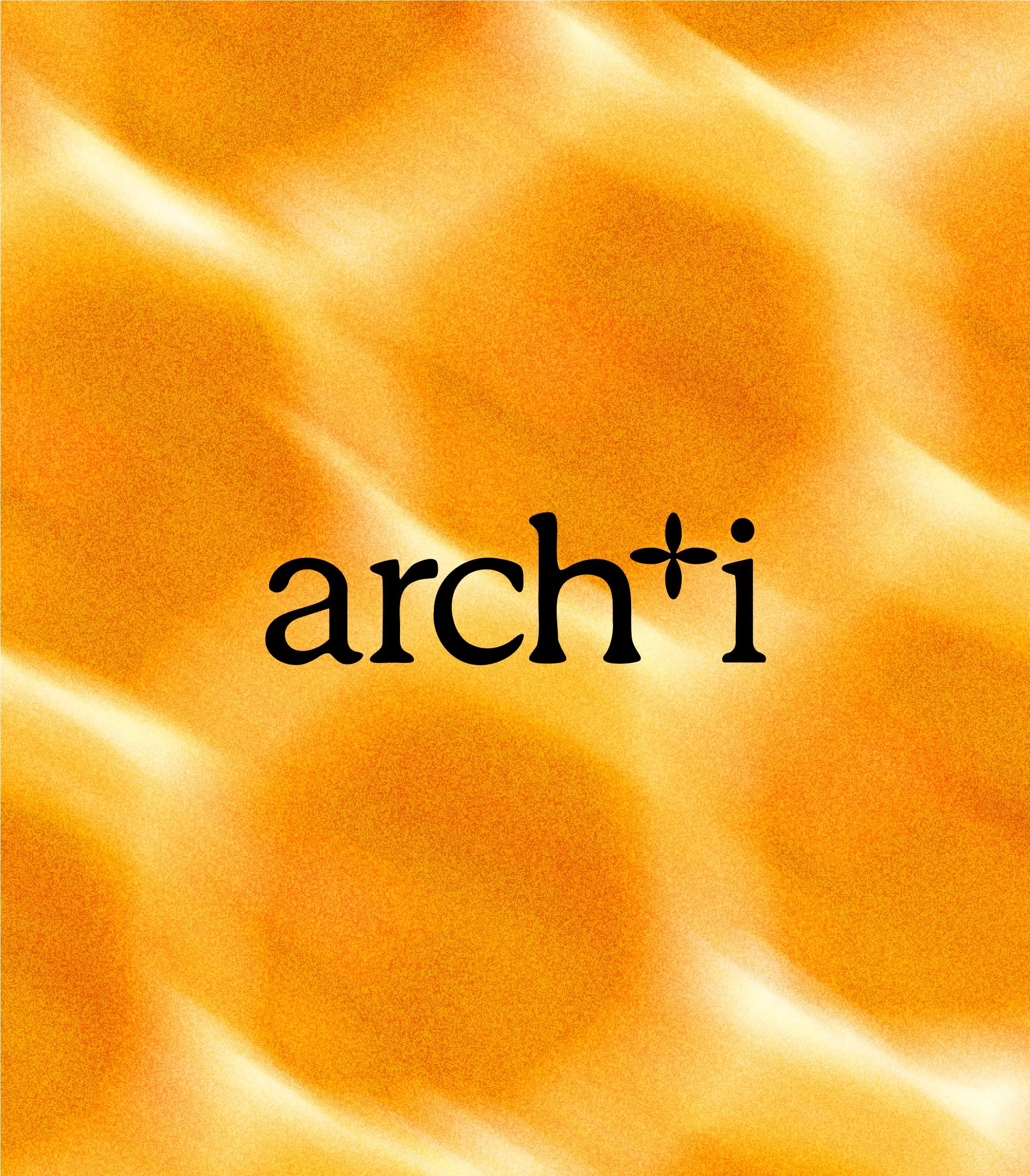
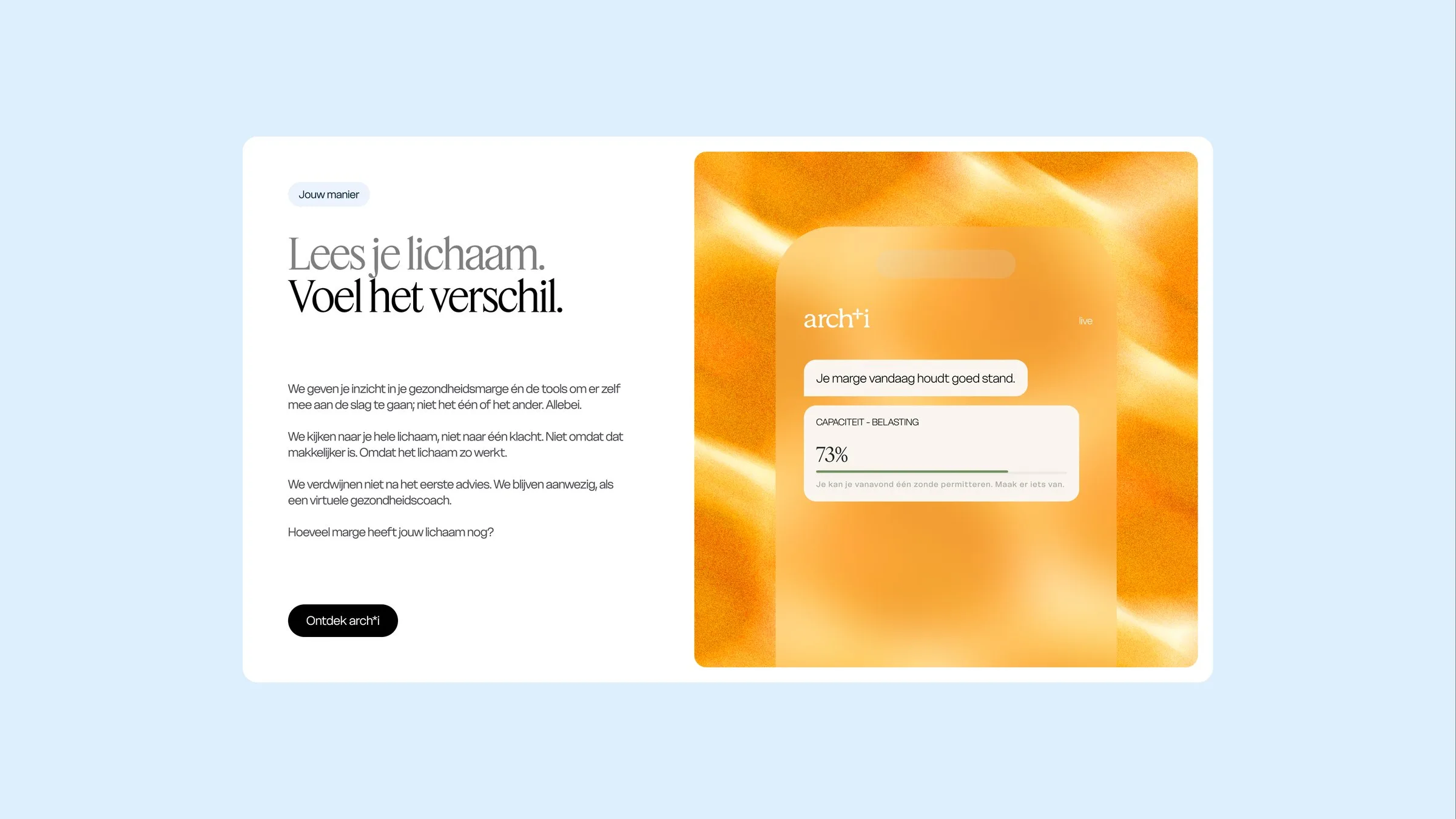
arch*i connects the dots you feel but could never prove, so you know every day what works for your body. It looks at the whole body instead of one complaint, and it doesn’t disappear after the first advice: it stays, as a virtual health coach.
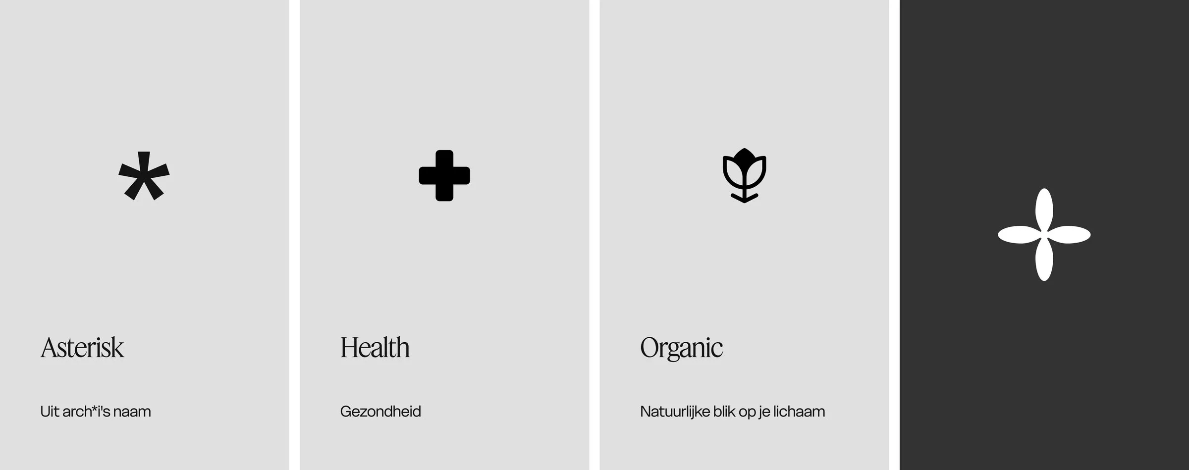
The brandmark looks simple but carries three ideas in one shape: the asterisk from the name, the cross of health and the petals of something organic. A natural look at your own body.


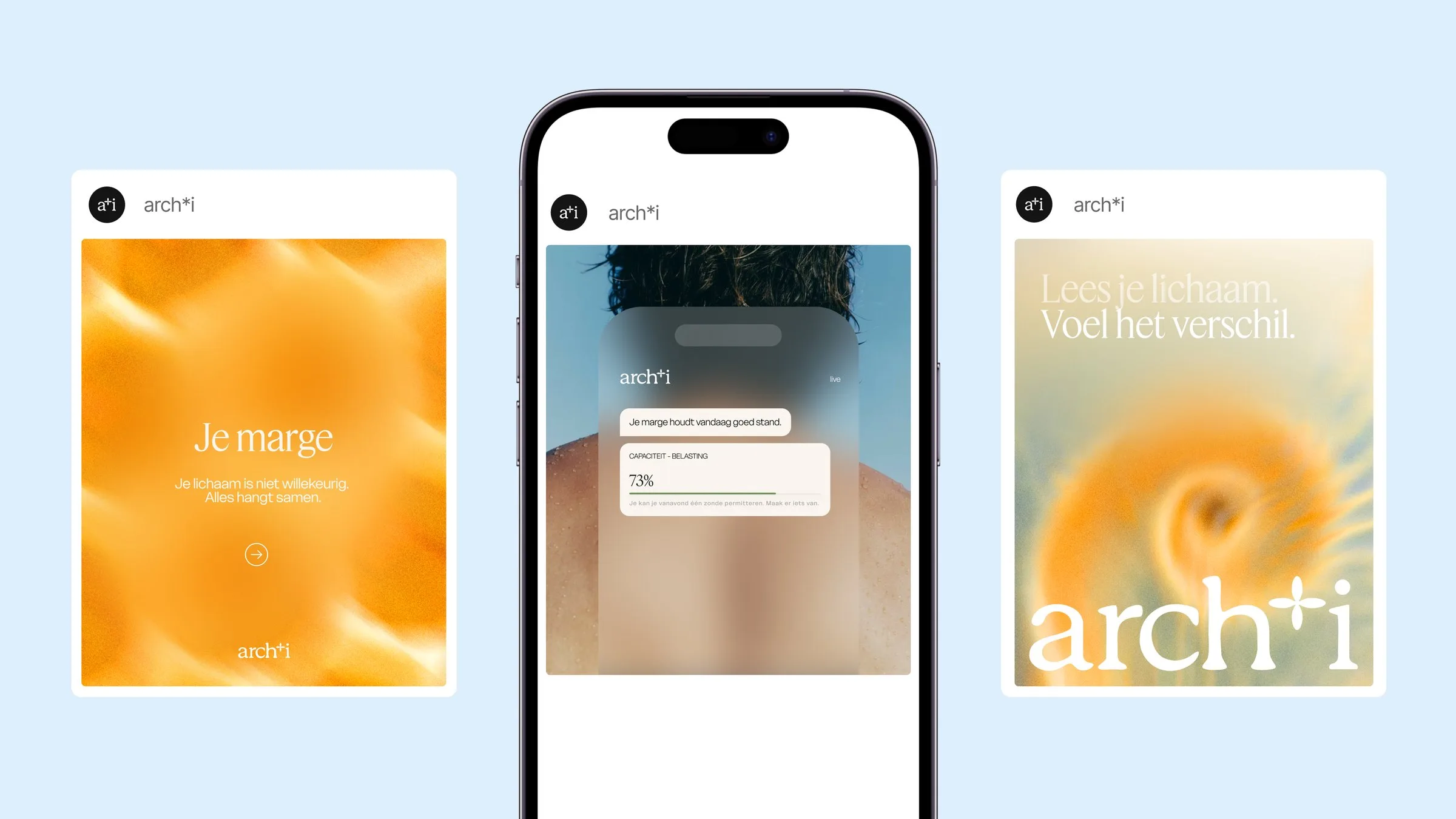

Website hero: Lees je lichaam. Voel het verschil.01 / arch*i wordmark on a warm orange blurred texture02 / Social posts and the app around one phone03 / Woman with eyes closed against a blue sky04 / Woman smiling in the sun05 / Sage cap with the embroidered wordmark06 / Brandmark meaning: asterisk, health, organic07 / Feature and Delight, the two typefaces08 / Bare back with drops of sweat against the sky09 / App card: your margin is holding up today, 73%10 / Accent colours: dark brown, light brown, jeans, light blue, sage, light sage11
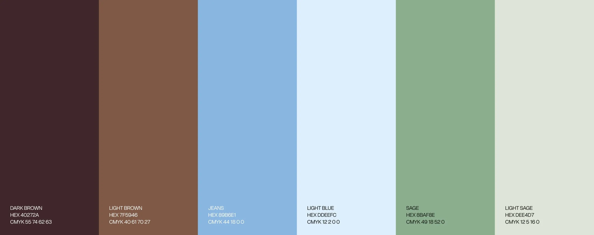
Feature, a sharp serif, carries the voice, Delight keeps everything else readable. Browns, jeans blue and sage stay close to skin and sky, blur softens photography and UI into one calm layer, and people are shot in honest, unposed moments in natural light.